Louisa Coffee / Visual Identity

Louisa Coffee / Visual Identity

Louisa Coffee / Visual Identity

Project

Louisa Coffee VI

Role

Lead Brand Designer

Date

2017-2022

Type

VIsual Identity

The challenge

I led the development of a new brand system, covering visual tone, photography, packaging, advertising, and identity applications. Our team's aim is to refine the overall tone to better reflect the sophistication associated with "premium coffee."

Brand Personality

QUALITY

QUALITY

Authentic

Authentic

MODERN

MODERN

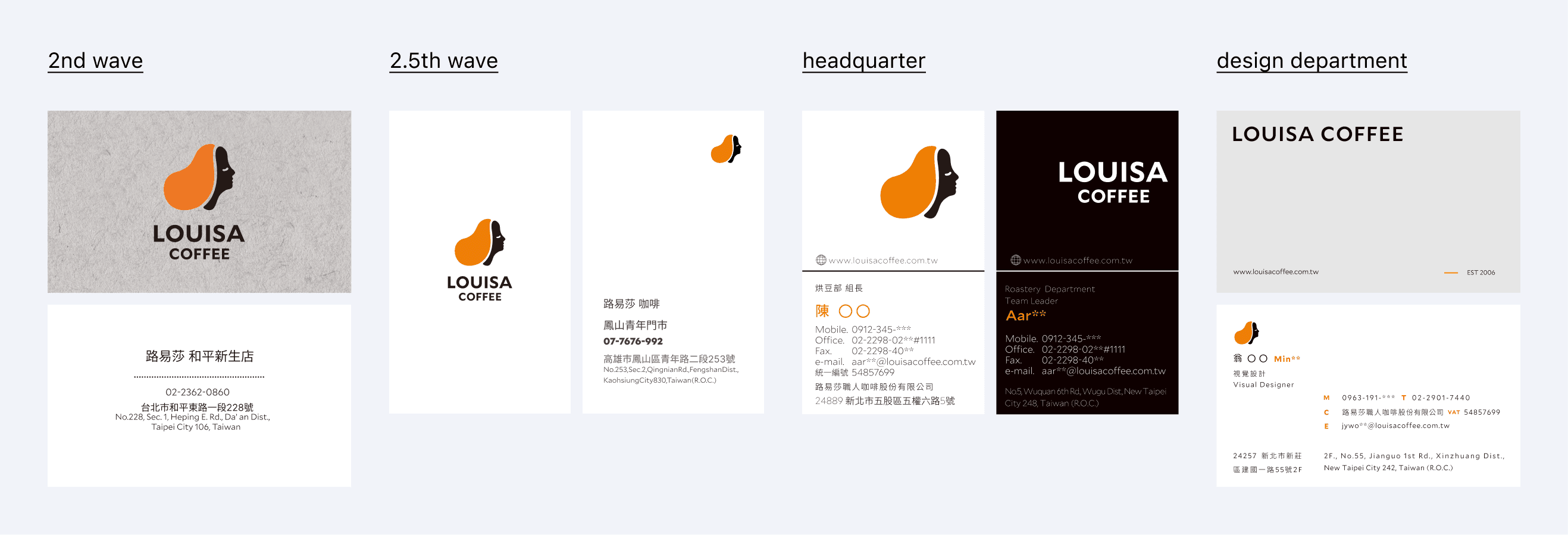
business card

business card

business card

APPLICATIION

APPLICATIION

APPLICATIION

PRINT

PRINT

PRINT

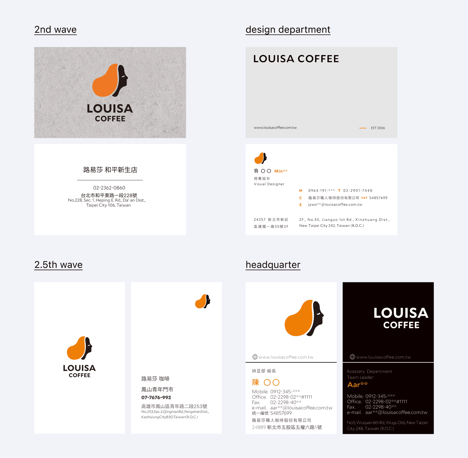
BEFORE

✶ Structure - Diverse design leads to brand identity confusion

✶ Hierarchy - Lack of clear information structure

✶ Clarity - Ineffective brand communication

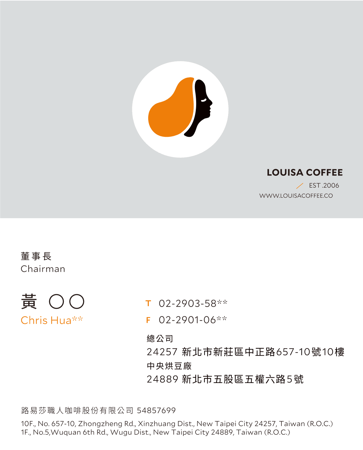
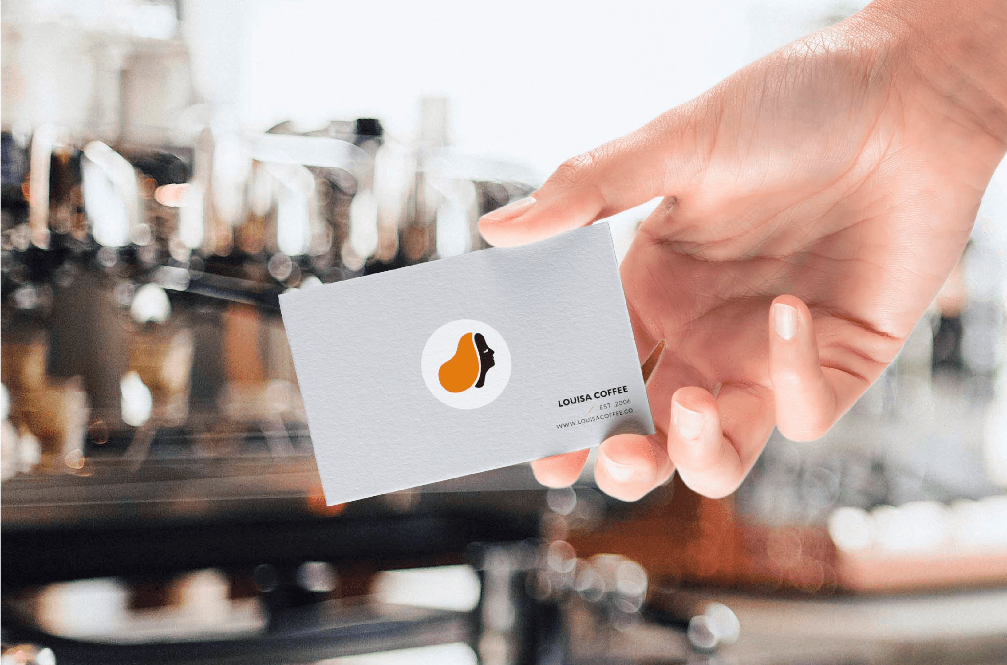
AFTER

✶ Structure - Combines into one cohesive design

✶ Hierarchy - Clear visual guidance and text hierarchy

✶ Clarity - Strengthens the brand image by presenting a unified and cohesive visual identity

poster

poster

poster

commercial

commercial

commercial

PRINT

PRINT

PRINT

Photography

Photography

Photography

Before

✶ Style - Inconsistent color tones and photography style

✶ Layout - Lack of uniformity in layout

✶ Identity - Limited logo visibility and incorrect usage of fonts

After

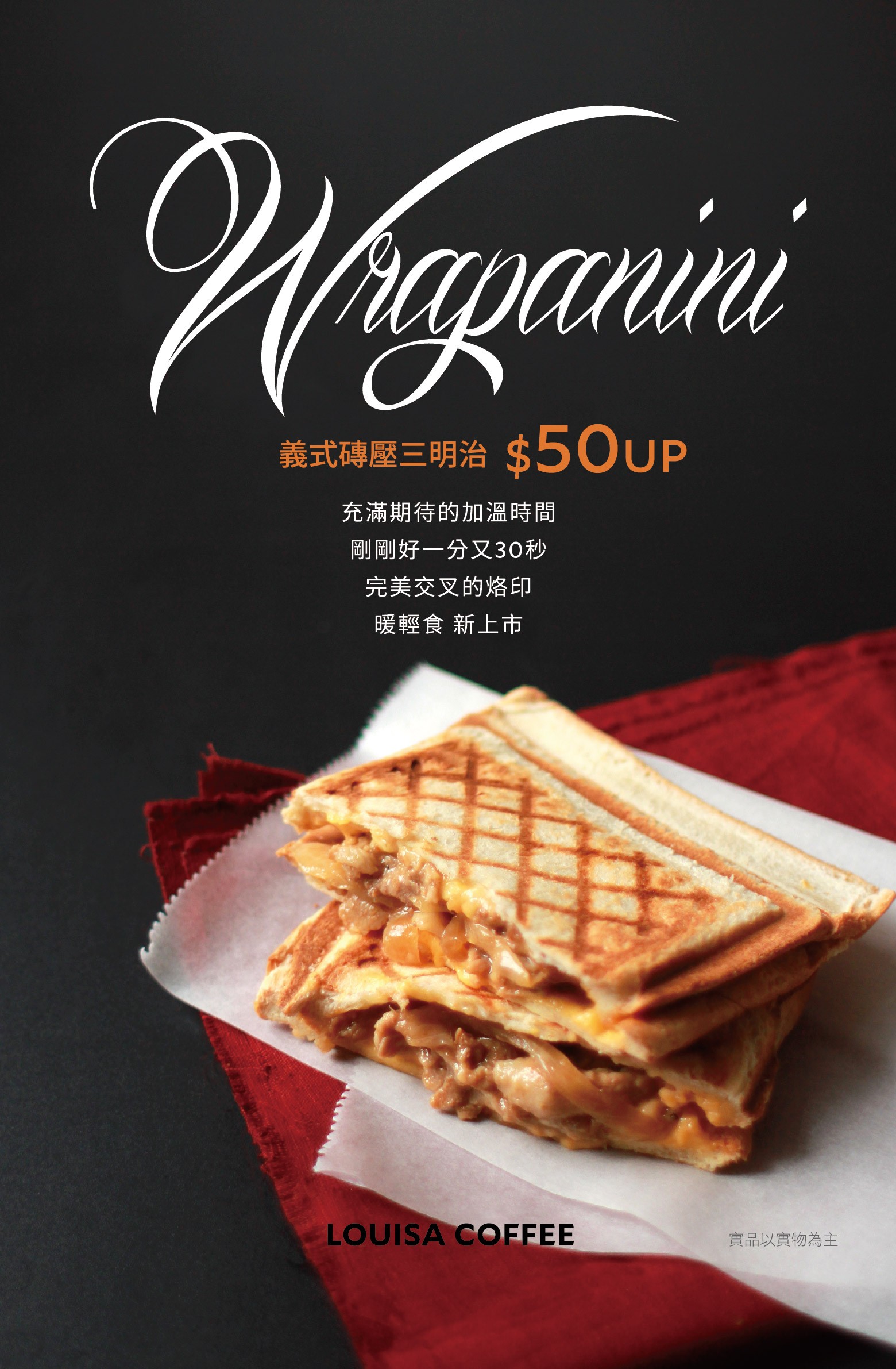
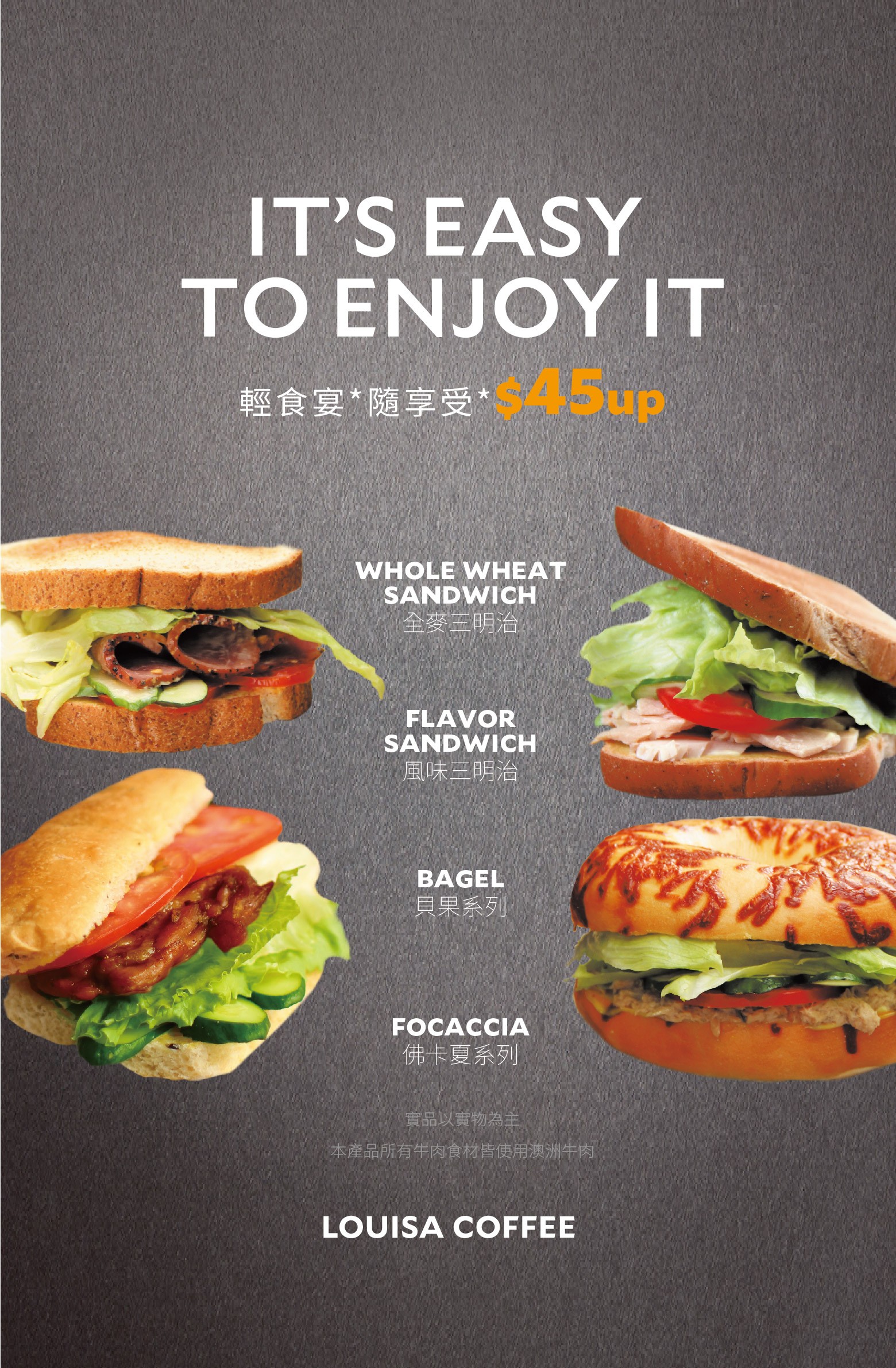
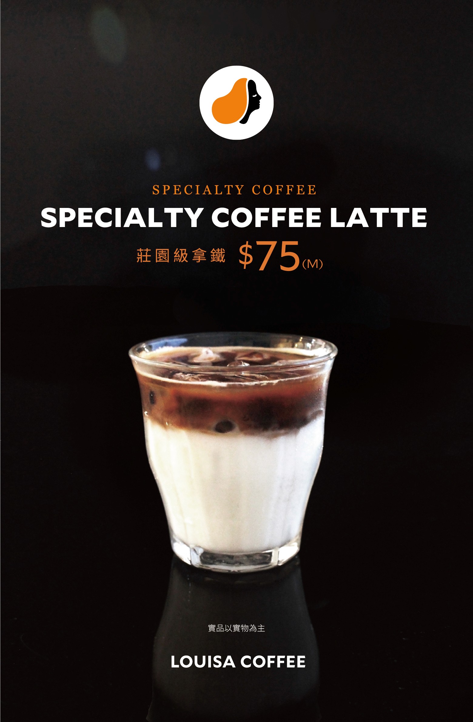
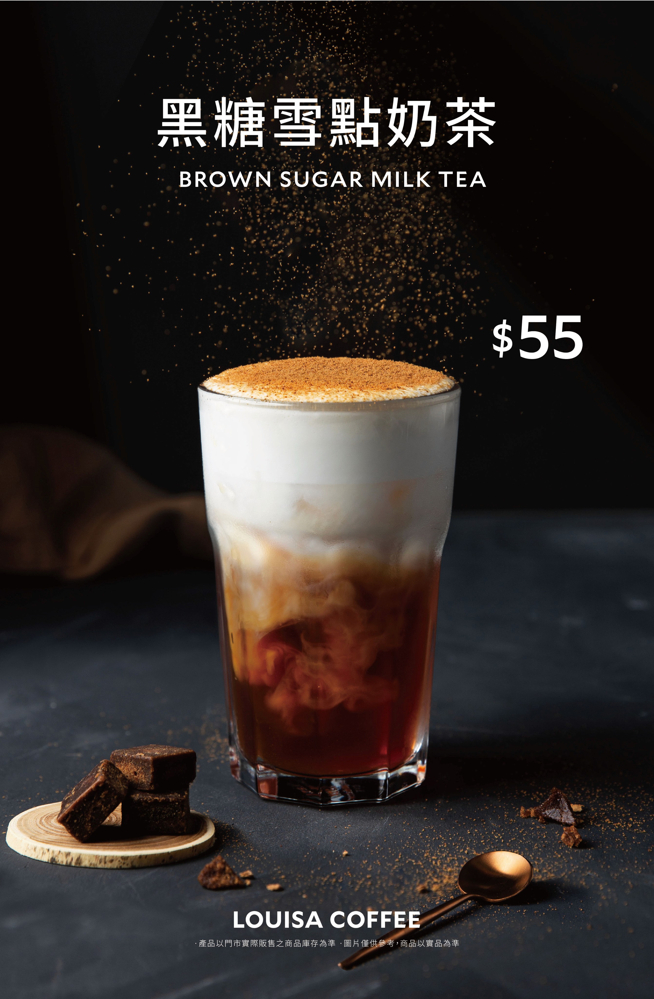
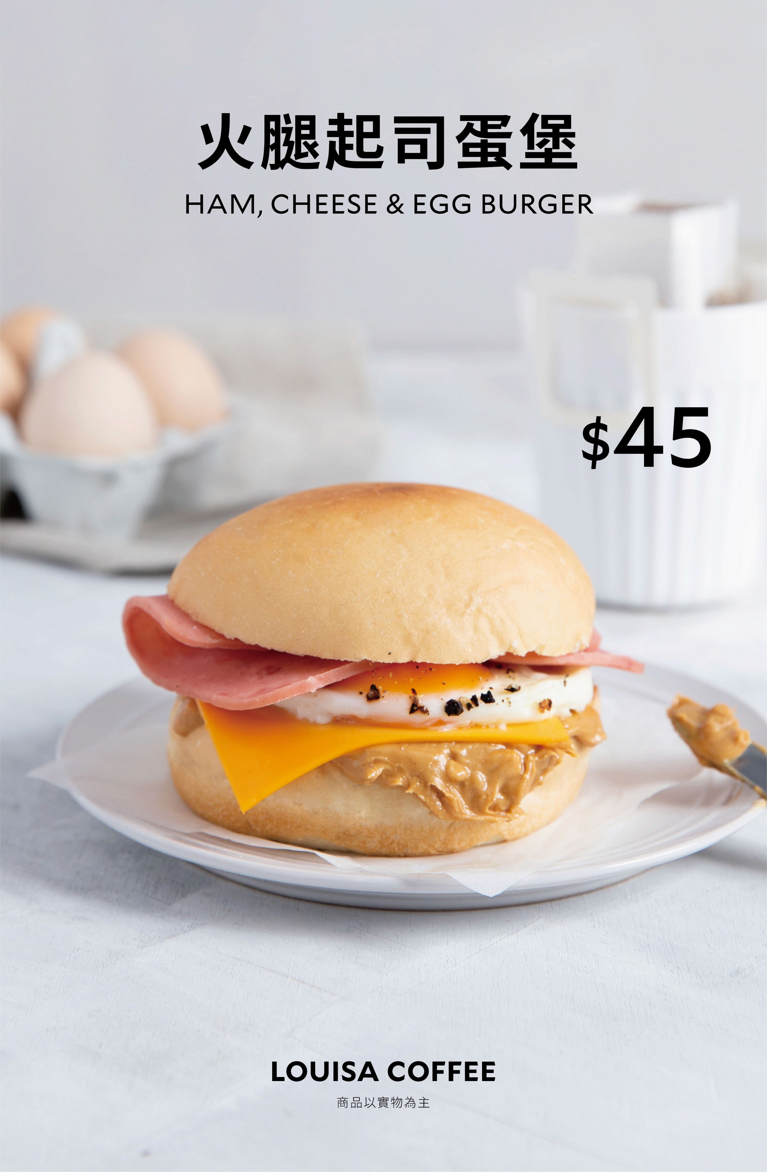
✶ Style - Vibrant photography which aligns with brand style

✶ Layout - Standardized layout grid

✶ Identity - Correct usage of brand typography

brochure

brochure

brochure

commercial

commercial

commercial

PRINT

PRINT

PRINT

Photography

Photography

Photography

before

✶ Structure - Diverse design leads to brand identity confusion

✶ Hierarchy - Lack of clear information structure

✶ Clarity - Ineffective brand communication

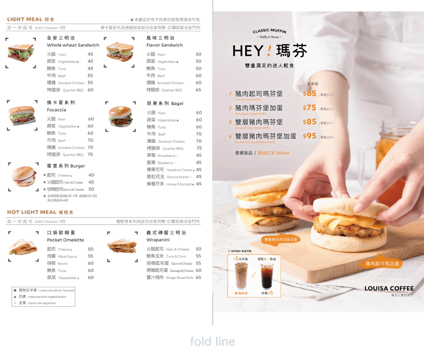
A4 Letter fold / Brochures

Multiple version

generic brochures

promotion brochures

After

✶ Style - Unified design for clearer guidance

✶ Layout - Standardized layout grid

✶ Identity - Updates on product imagery with improved visual aesthetics

A4 Letter fold / gerneric Brochures

Single version

10*21cm Card / Promotion & Campiagn

Acrylic display stand / Die-cut

What I DID

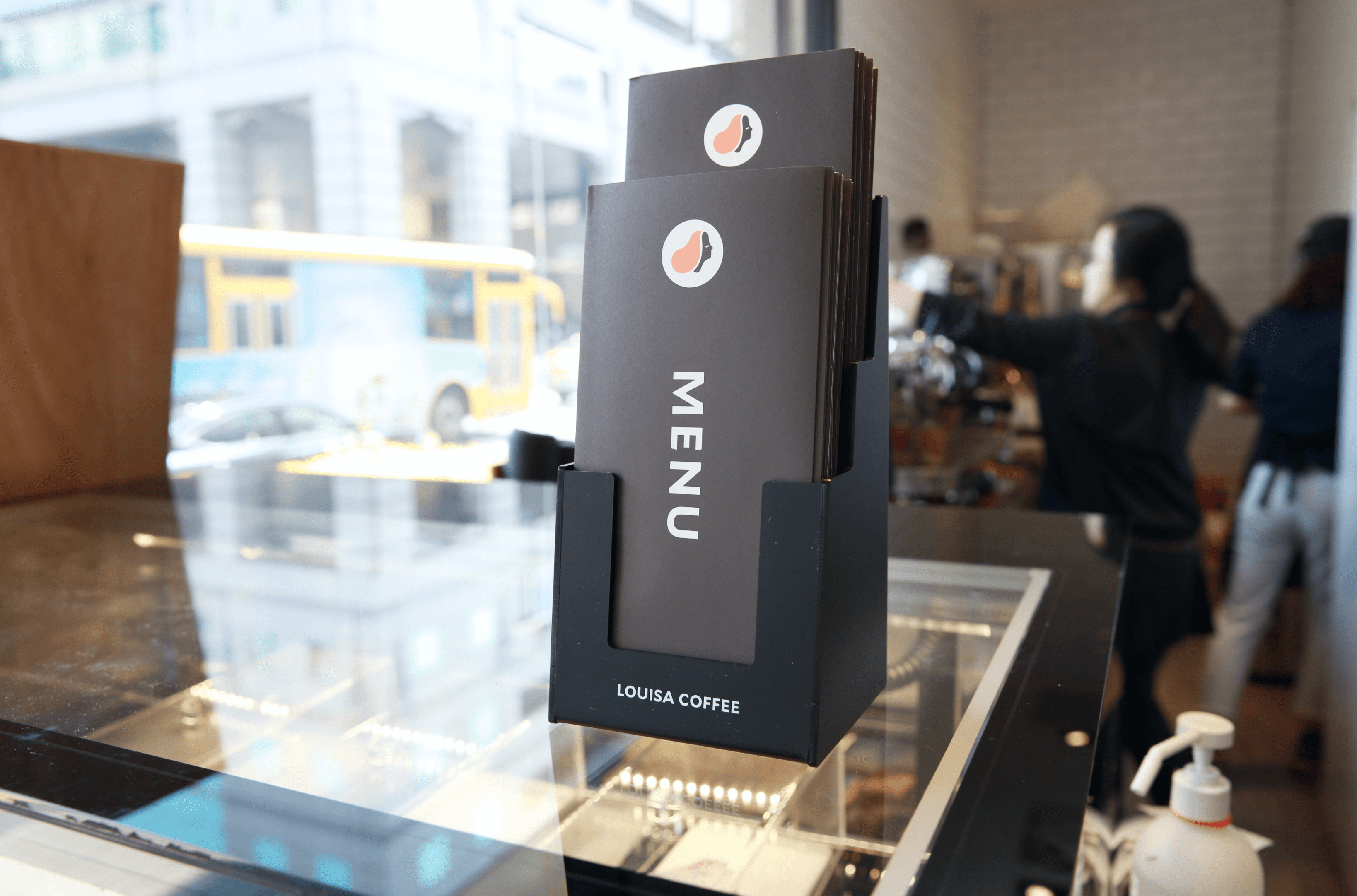
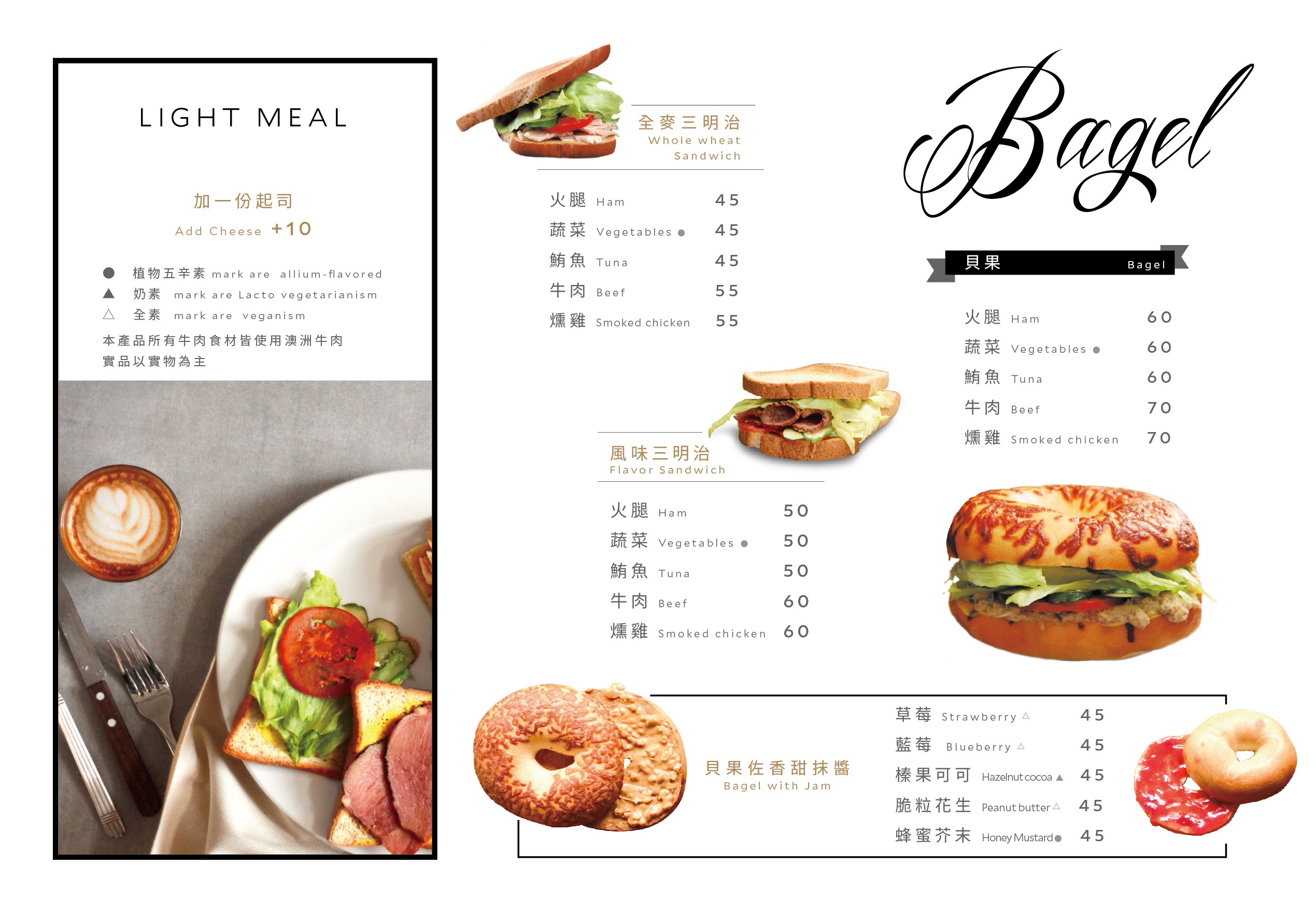
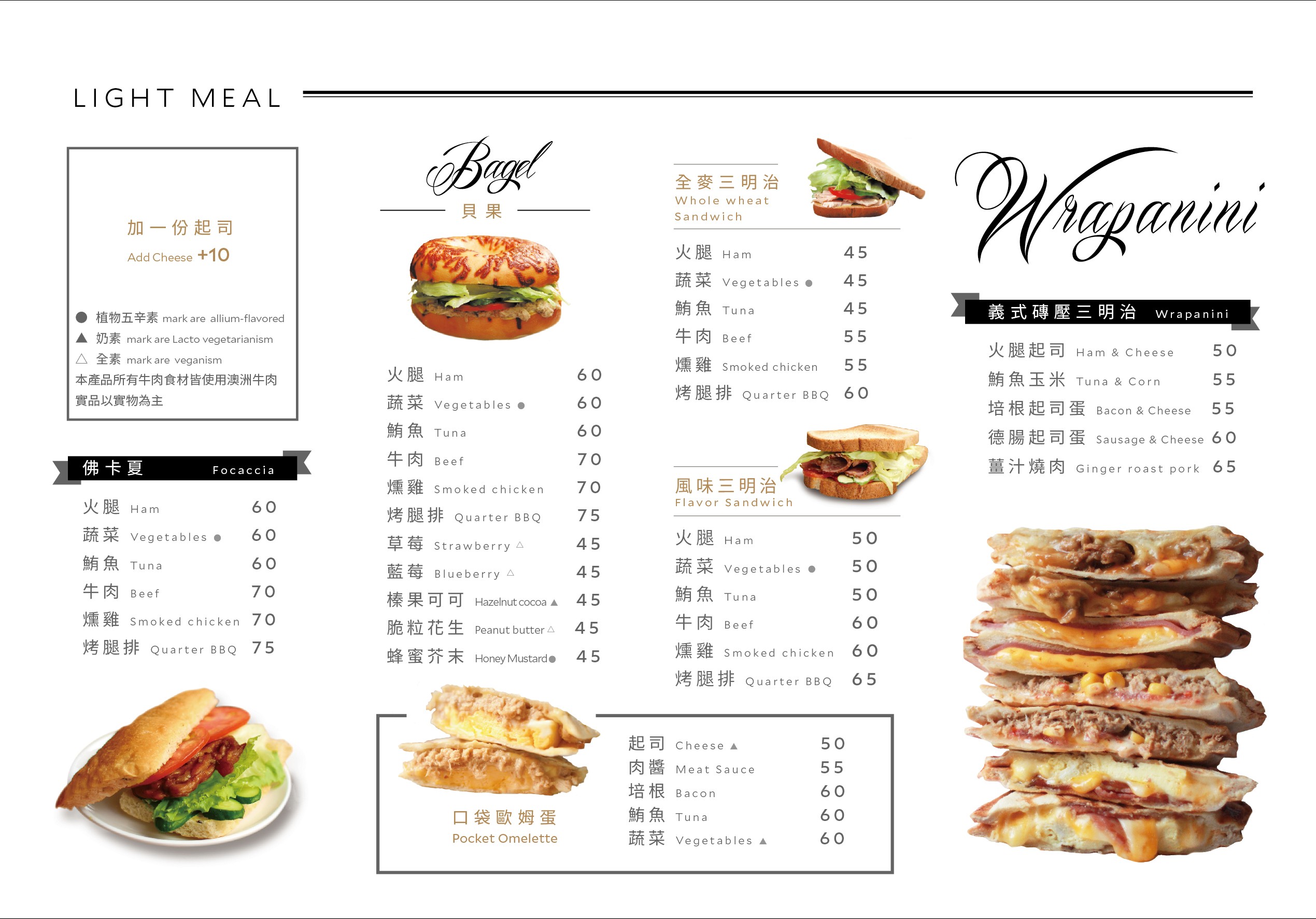
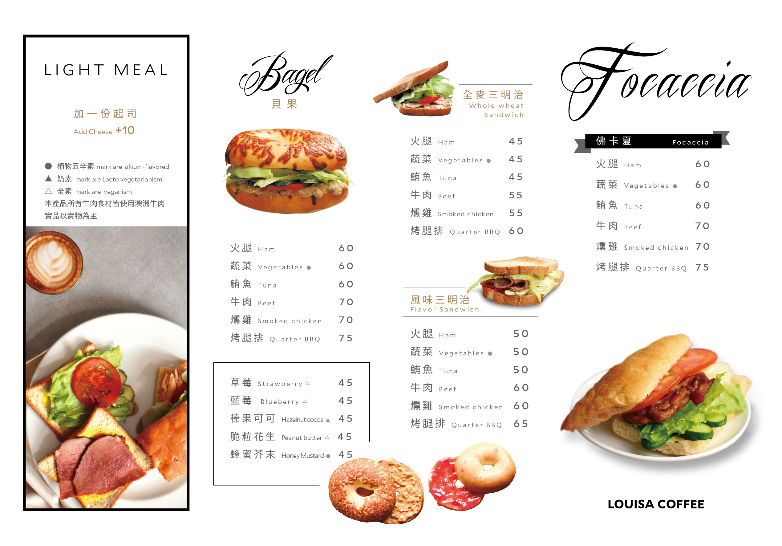
The original brochure design differed only in the cover, causing redundancy and limiting printing. I redesigned it with a letter fold and created an acrylic display stand. Now, promotion cards and generic brochures are easily swappable, and the stand can showcase multiple versions simultaneously.

The original brochure design differed only in cover design between generic and promotional versions, causing redundancy and limiting printing. Thus, I redesigned the brochure with a letter fold and created an acrylic display stand.

By distinguishing between promotion card and generic brochure formats, content can be easily swapped. The display stand can showcase multiple brochure versions simultaneously.

Super minimal notion creator template. Designed with a focus on clarity and ease of use, this template provides users with a crisp and uncluttered workspace where creativity can thrive.

sample production process

In-store application scenarios

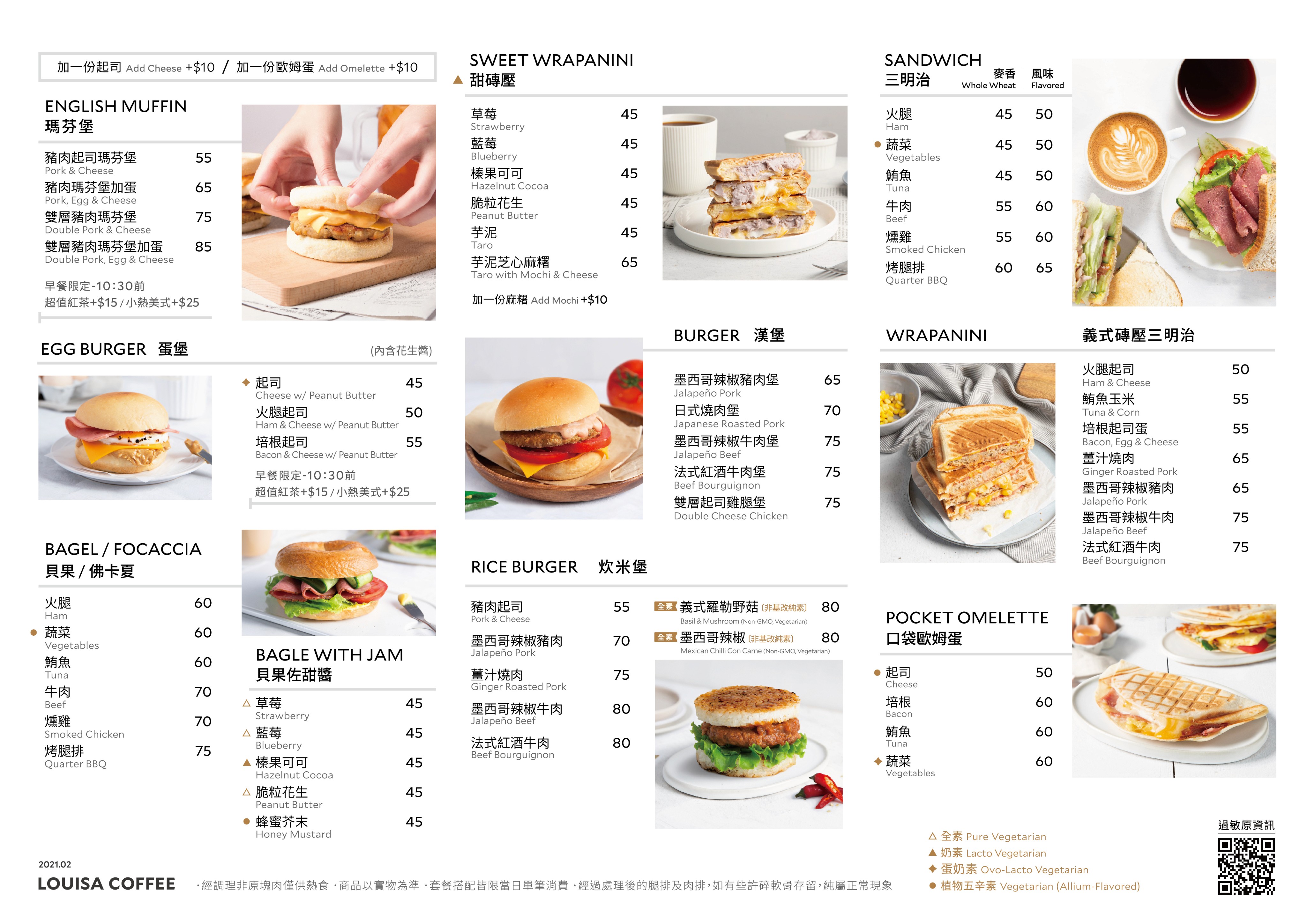
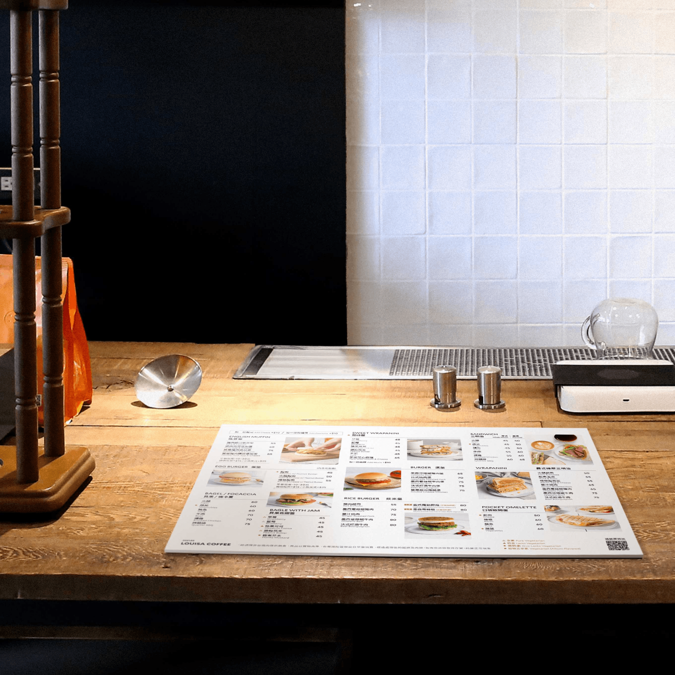
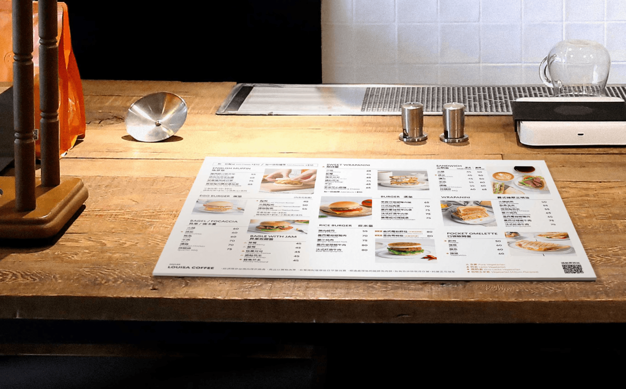
Counter Menu

Counter Menu

Counter Menu

commercial

commercial

commercial

PRINT

PRINT

PRINT

Photography

Photography

Photography

before

✶ Style - Different designs and usage scenarios lack guidance

✶ Layout - Less intuitive visual flow

✶ Identity - Images need updating to better align with the brand's new identity

A3 5mm foam board / Multiple version

After

✶ Style - Unified design for clearer guidance

✶ Layout - improvement on intuitive visual flowi

✶ Identity - Updates on product imagery with improved visual aesthetics

A3 5mm foam board / Single version

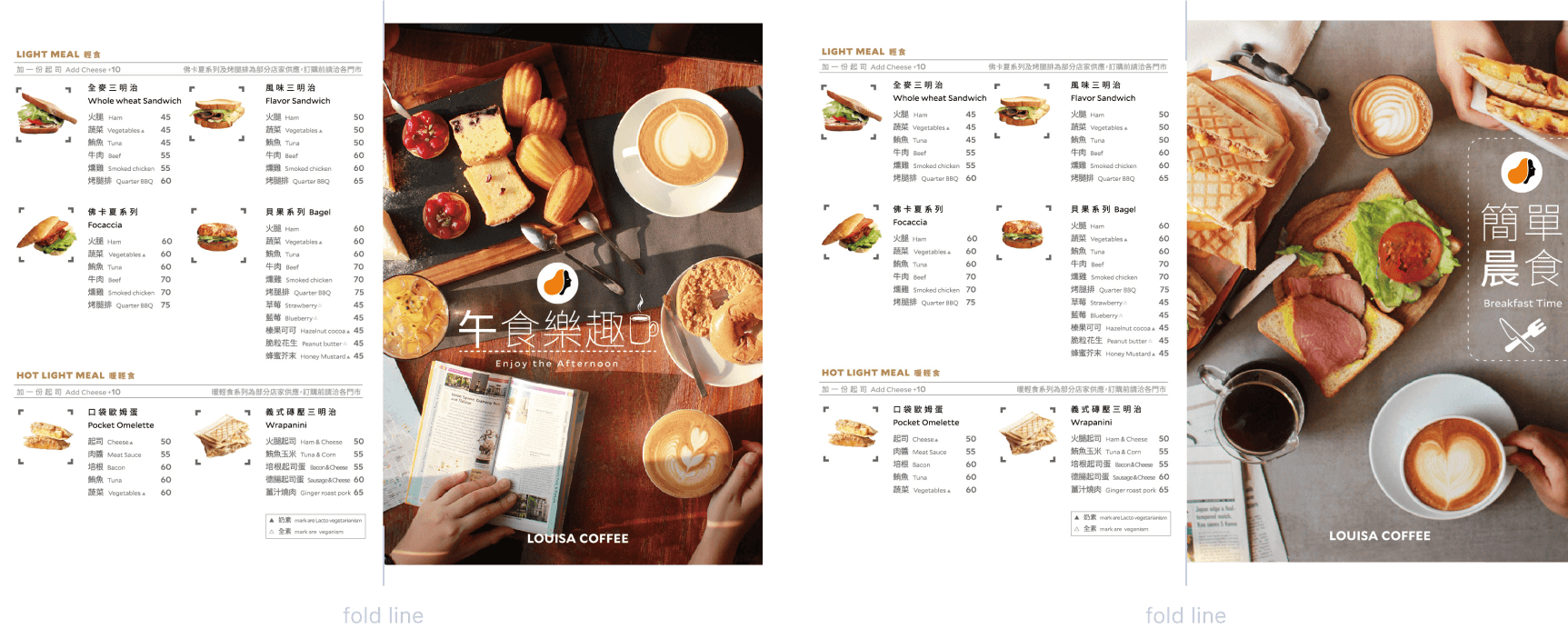
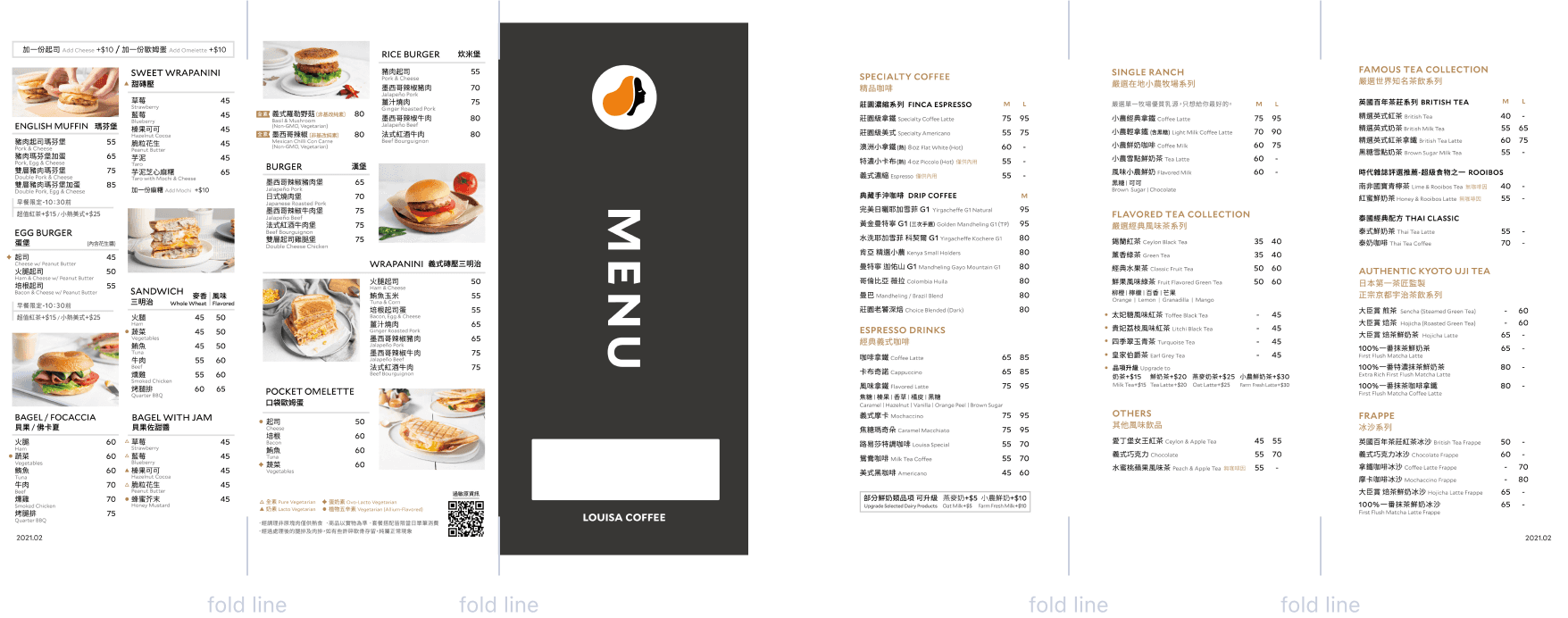
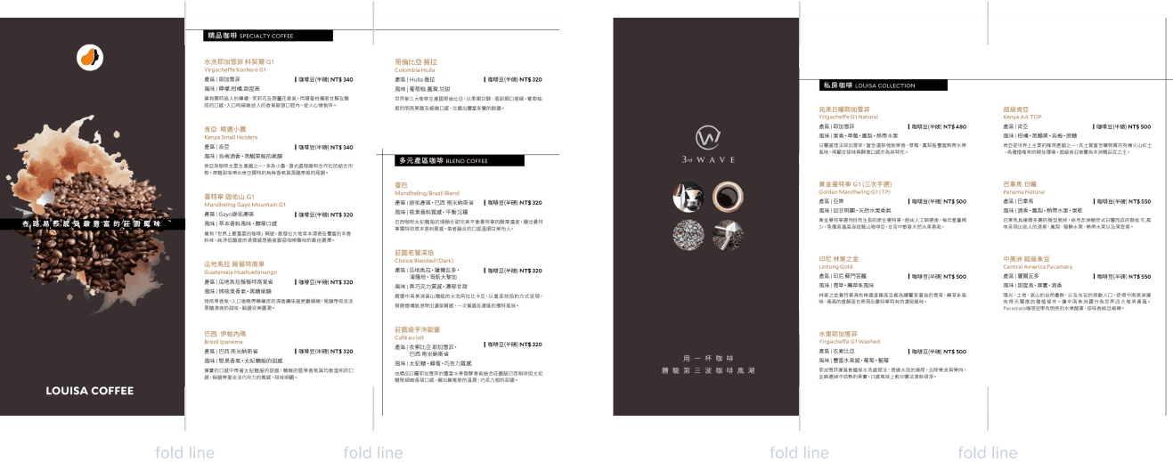
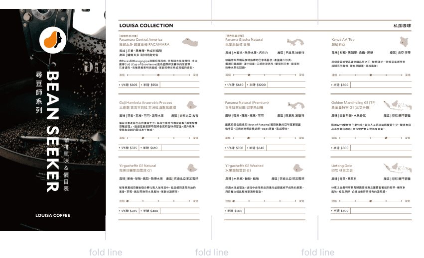
Product Brochure

Product Brochure

Product Brochure

commercial

commercial

commercial

PRINT

PRINT

PRINT

before

✶ Content - Incomplete product listings

✶ Format - Brochure size needs adjustment

✶ Design - Requires optimization to better align with the new brand identity

A4 Letter fold

After

✶ Content - Added comprehensive product listings

✶ Format - Adjusted the size of the product brochure accordingly

✶ Design - Re-designed and restructured the layout with a precise grid style

21*40cm Accordion fold

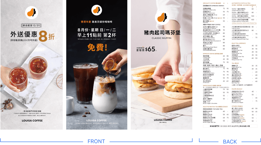
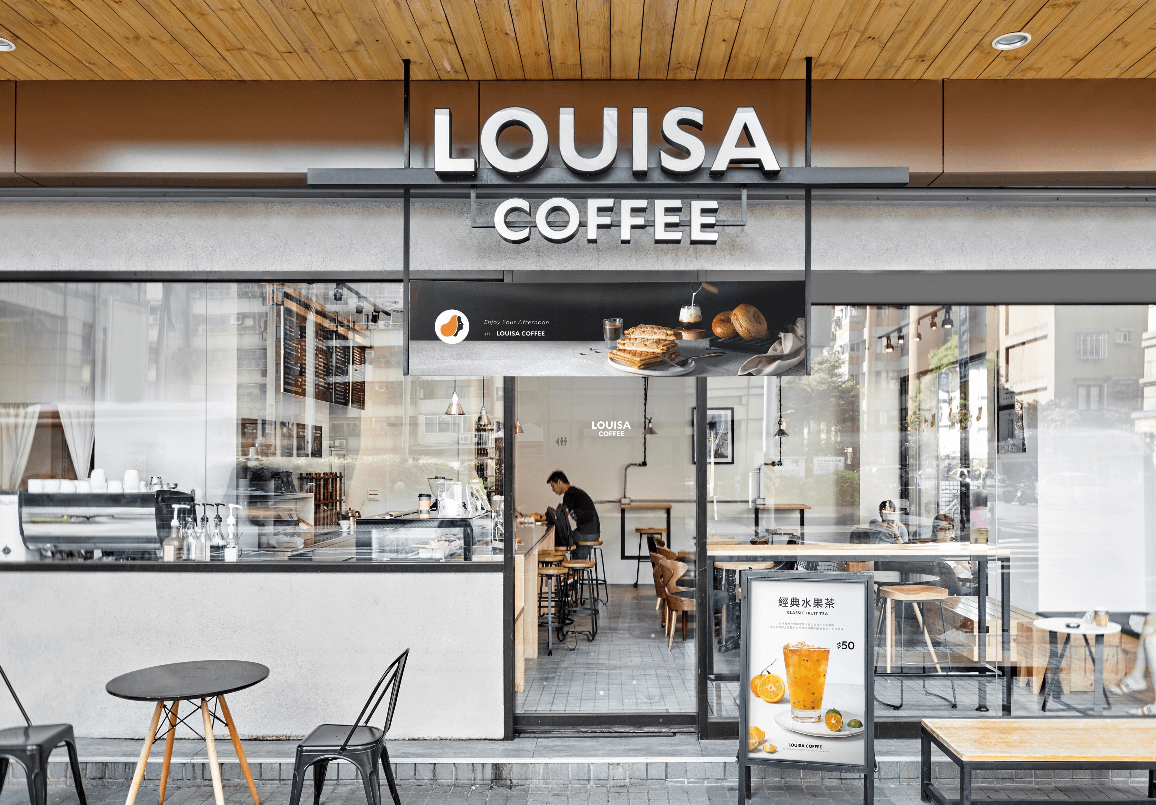
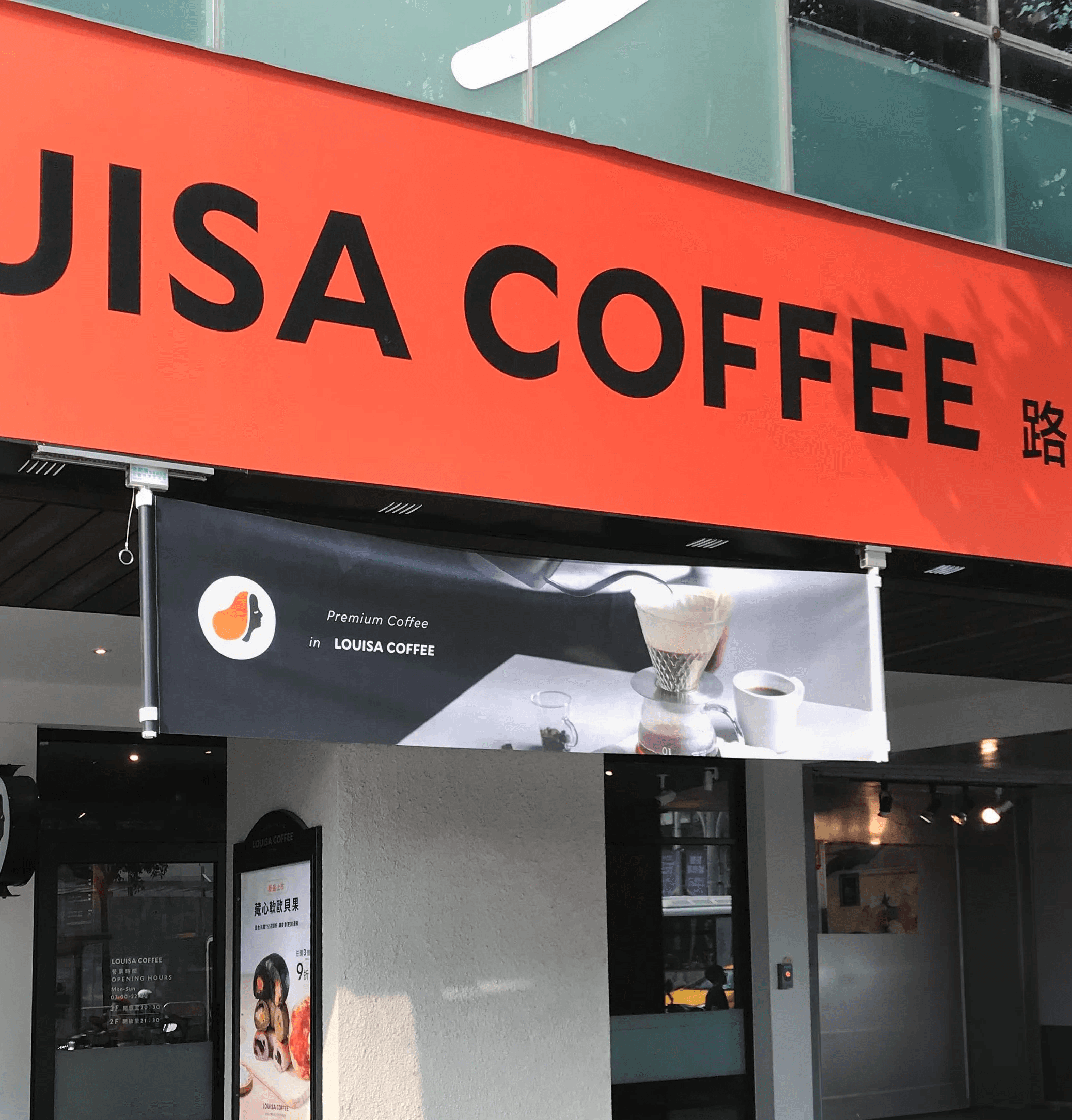
Store Front Menu

Store Front Menu

Store Front Menu

commercial

commercial

commercial

PRINT

PRINT

PRINT

Photography

Photography

Photography

before

✶ Content - Not sufficiently coffee-oriented, fails to convey the ambiance of premium coffee

✶ Layout - Requires refinement

✶ Identity - Images need updating to better align with the brand's new identity

After

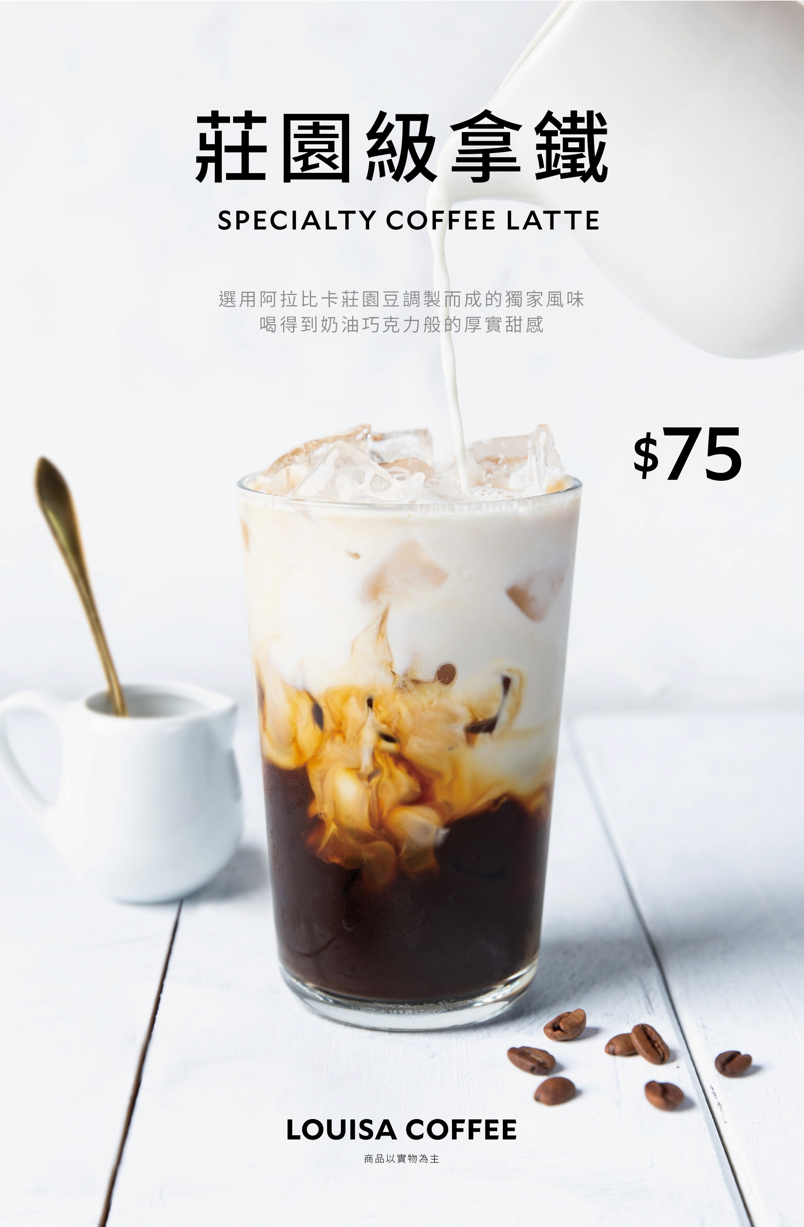
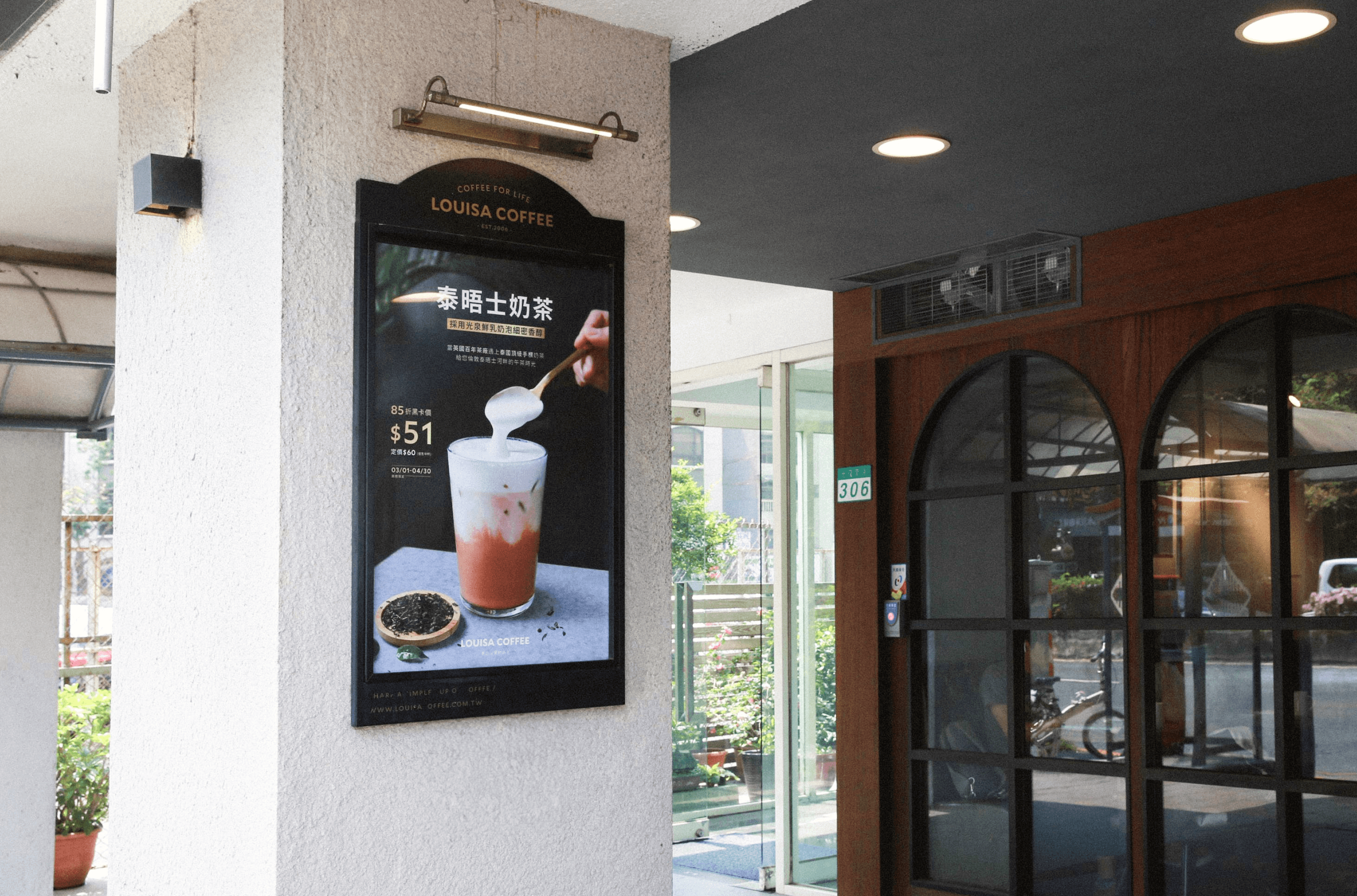
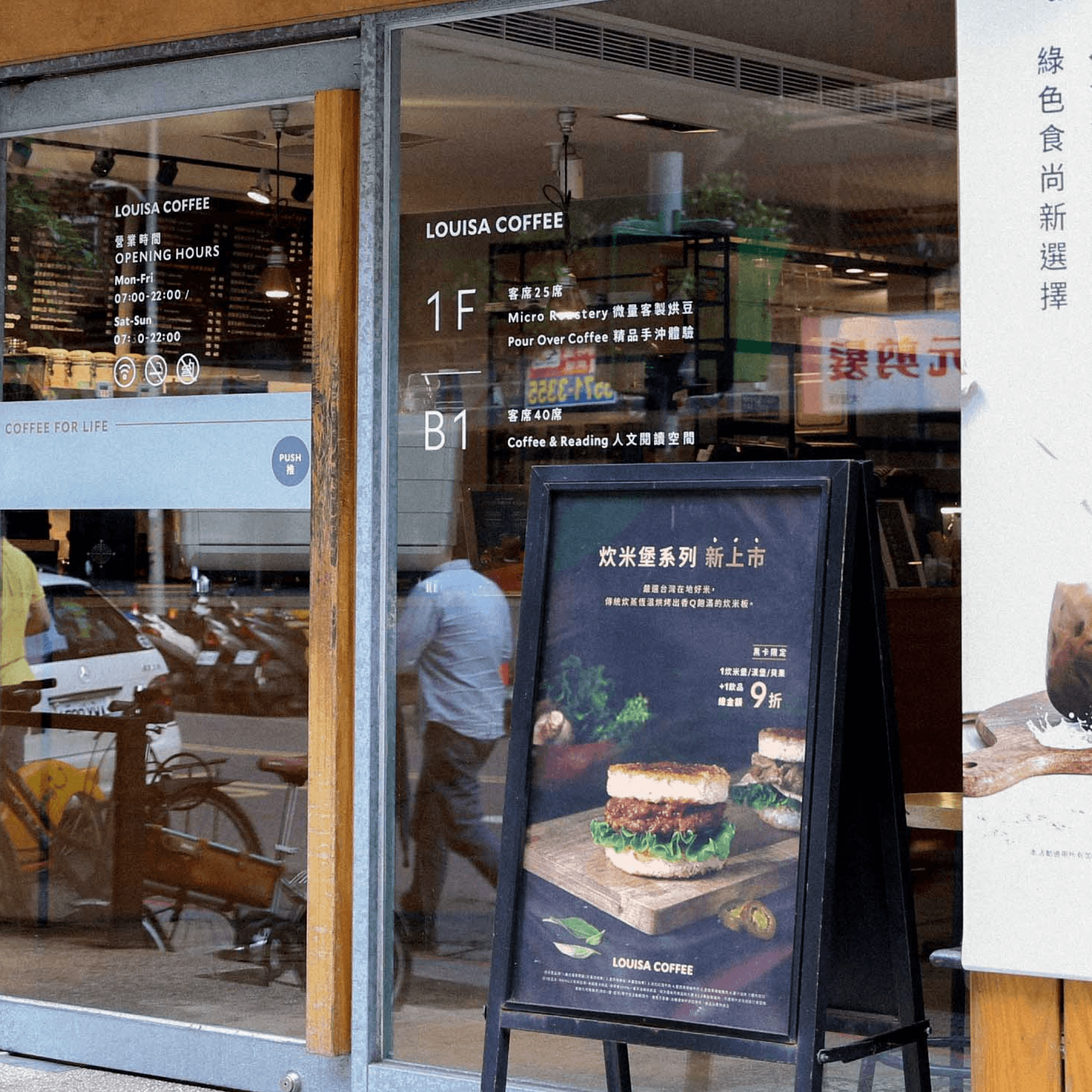
✶ Content - The visuals now place a stronger emphasis on premium coffee.

✶ Layout - The text differs from the poster below, leaning towards more evocative wording.

✶ Identity - Updates on product imagery with improved visual aesthetics

Photography

Photography

Photography

Project Planning

Project Planning

Project Planning

Creative

Creative

Creative

What WE DID

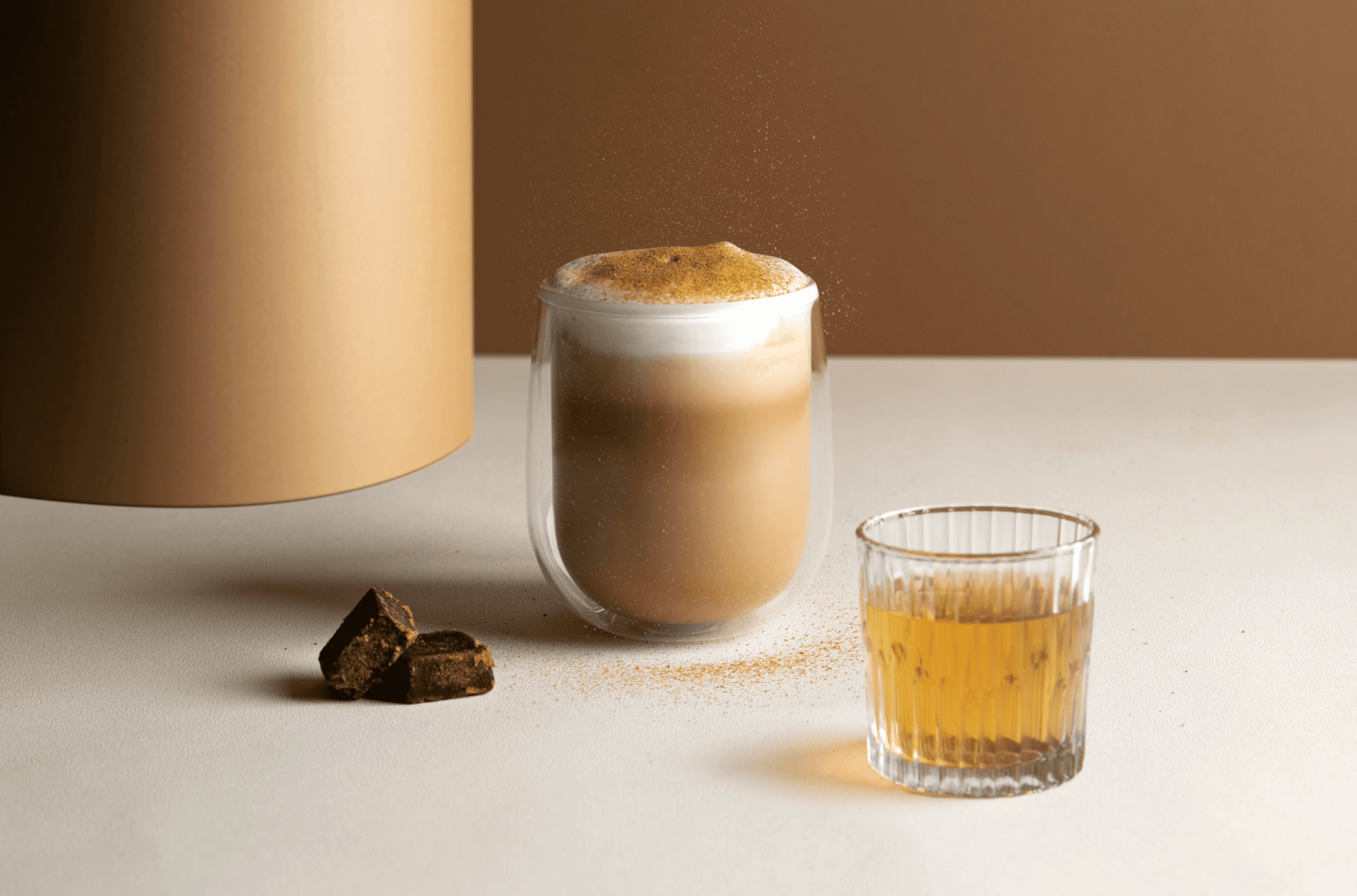
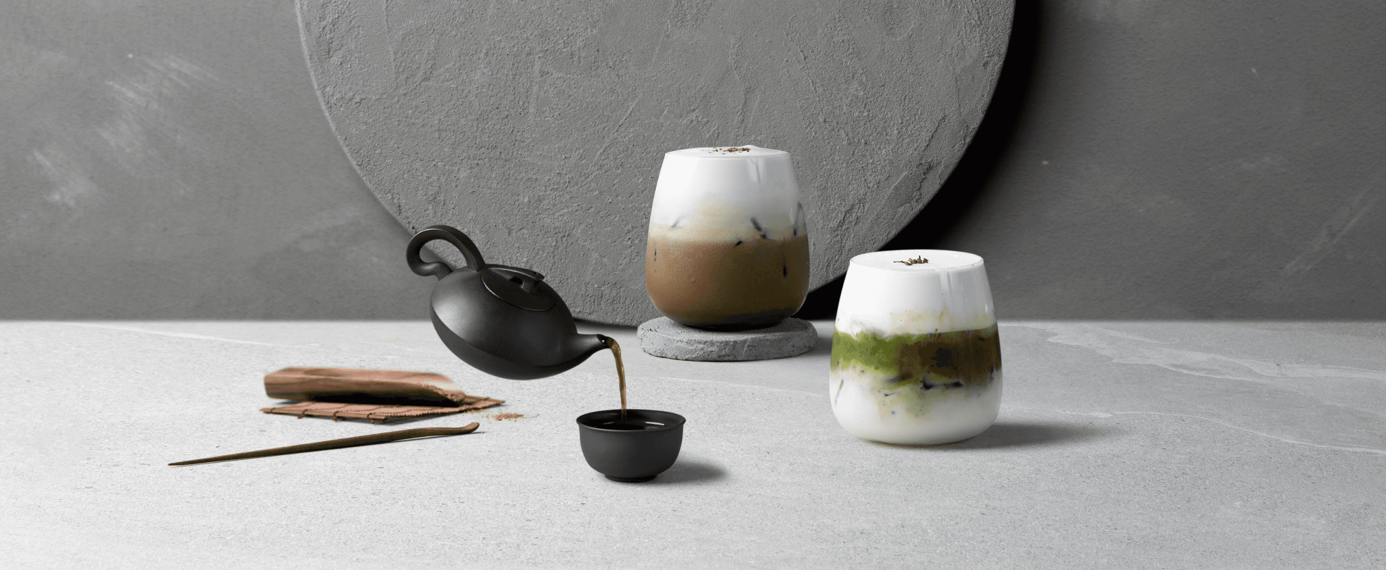
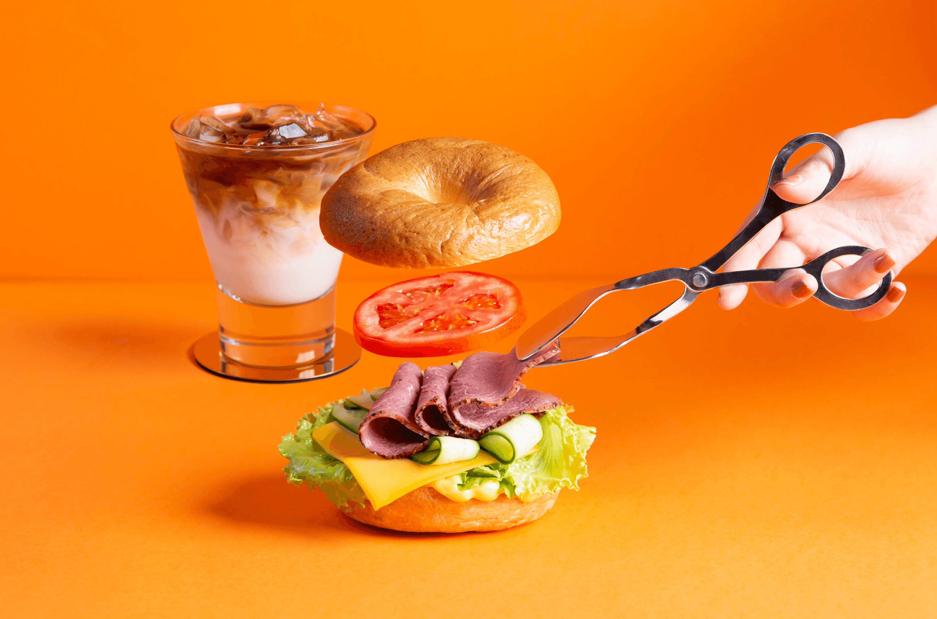
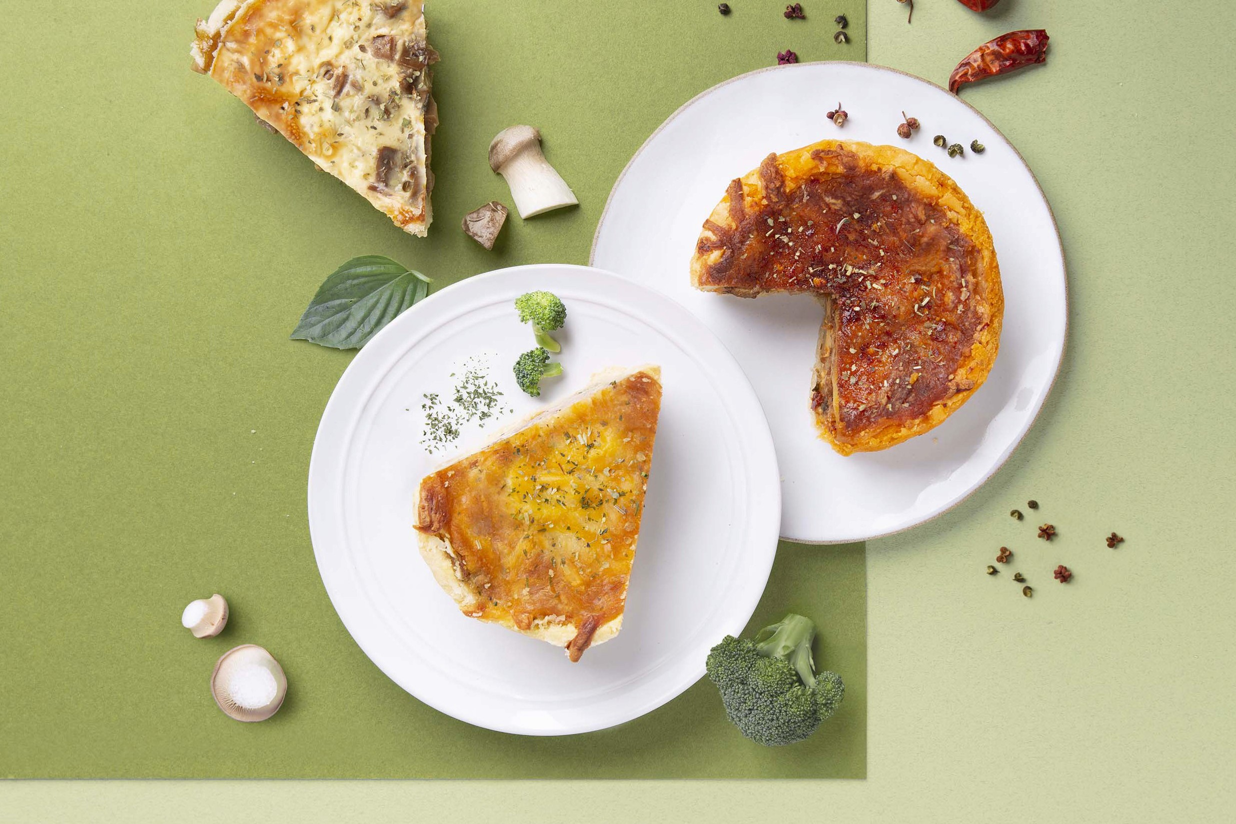
My colleague and I collaborated on photography plans for events and campaigns, aligning with the new brand tone. Throughout, we brainstormed, experimented, sourced materials, and crafted unique props. Through this, I learned from my talented teammate, exploring various techniques and styles, resulting in captivating images.

The original brochure design differed only in cover design between generic and promotional versions, causing redundancy and limiting printing. Thus, I redesigned the brochure with a letter fold and created an acrylic display stand.

By distinguishing between promotion card and generic brochure formats, content can be easily swapped. The display stand can showcase multiple brochure versions simultaneously.

Super minimal notion creator template. Designed with a focus on clarity and ease of use, this template provides users with a crisp and uncluttered workspace where creativity can thrive.

Related projects

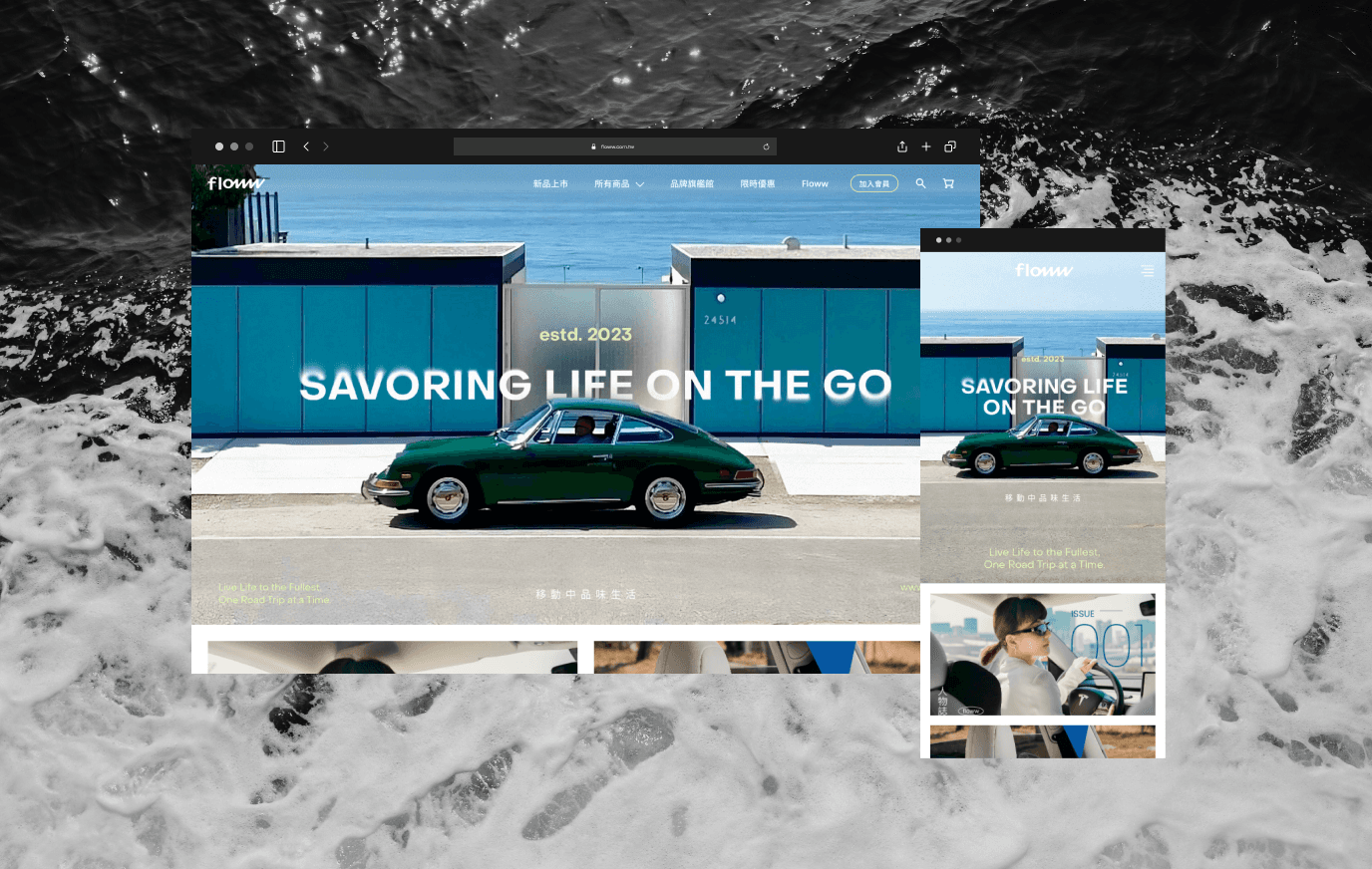
FLOWW

Louisa Coffee / Assets
  • LEXI LIN

    LEXI LIN

    LEXI LIN

    LEXI LIN

    LEXI LIN

    LEXI LIN

    LEXI LIN

    LEXI LIN

    LEXI LIN

    LEXI LIN

    LEXI LIN

    LEXI LIN

    LEXI LIN

    LEXI LIN

Tashkent, GMT 5+ 12:30

  • LEXI LIN

    LEXI LIN

    LEXI LIN

    LEXI LIN

    LEXI LIN

    LEXI LIN

    LEXI LIN

    LEXI LIN

    LEXI LIN

    LEXI LIN

    LEXI LIN

    LEXI LIN

    LEXI LIN

    LEXI LIN

Tashkent, GMT 5+ 12:30

  • LEXI LIN

    LEXI LIN

    LEXI LIN

    LEXI LIN

    LEXI LIN

    LEXI LIN

    LEXI LIN

    LEXI LIN

    LEXI LIN

    LEXI LIN

    LEXI LIN

    LEXI LIN

    LEXI LIN

    LEXI LIN

Tashkent, GMT 5+ 12:30